Sometimes you see a bold statement that just makes you want to go investigate if the fellow is right or is blowing smoke. Here is the one that caught my eye and seemed like it was worth a 30 minute investigation to me:
This I know is 100% true: No APS-C dSLR or mirrorless cameras costing under $2,000 can match the image quality of the NEX-5 right now:
That is as bold as it gets. “This I know to be 100% true” says that he is certain. Of course, what he fails to point out is that he is comparing jpeg engines at default settings and that he is comparing one ISO, and not one used by a lot of people. Thus, his bold assertion is almost child-like in its naiveté.
Had he qualified it with “in jpeg at default settings” then he would have been perfectly correct in his assertion. And people would have dismissed his statement with a great big yawn. So what … we don’t buy expensive cameras to shoot jpeg at the manufacturers’ defaults. (Some do, but they are unlikely to be reading this blog.)
So I did the obvious and downloaded the RAW files he links to here. It is, of course, a comparison of the 6400 ISO files in jpeg at DPReview.com. Go and look to see what he means. The Sony image does indeed look a little nicer. The edges have a bit more integrity, which makes the lips look fantastic, and the eyes are quite sharp looking. Of course, the eyelashes are missing :-) …
So the Sony has better smoothing algorithms in jpeg, at least for that one tiny crop. But what about RAW? Well, I’ve processed them and will show crops here (just select “RAW” at the top of the comparator and you can download them yourself and process in ACR.) I claim fair use of their copyright for educational purposes if anyone decides to whinge at me for showing these crops.
My settings in ACR were the best I could do for each camera. I tried to get them as identical as possible when viewed at 100%. I added a bit of local contrast in CS5 and dialed each up from 0 opacity until they looked the same. This is the only way to prove or disprove a claim that one camera looks better than another at a specific ISO.
Crop 1
This one is my favorite, as it shows a piece of weaving that has such fine texture and such obvious 3-dimensionality that it immediately smokes out excess smearing. It also includes a bit of the face next to it on the standard test image. This face has a lot of cross hatching to form the textures. At 6400 ISO we really don’t expect too much of that fine detail, but it is a treat to see how much each camera can see.
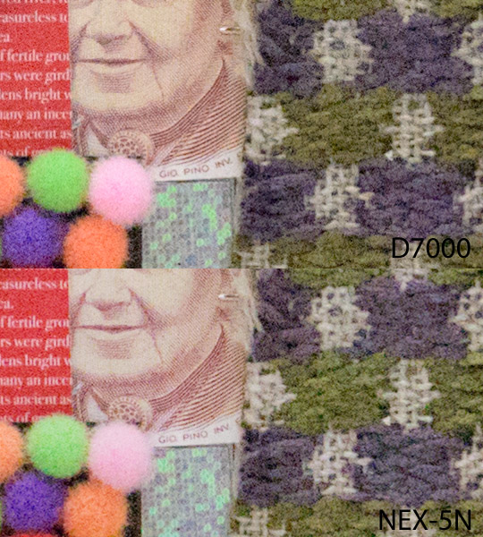
The subtle vertical lines on the cheek in the Nikon shot is interesting, in that there is obvious vertical cross hatching on the cheek at lower ISO. But the frequency is very high and here see see what looks like a very subtle interference pattern, almost like moiré.
Anyway, there surely is not enough difference here to make any statement about which is better. And do remember that these crops at 100% on screen are the same as inspecting a 46” wide print at 20 inches. You will never see this detail in a real print or on the web. So the very subtle differences will wash away.
Crop 2
This is one of the classic crops from that test image. The globe is not very large, so the lettering is pretty small as a percentage of the overall image. Thus, we can expect it to get harder and harder to read as sensor size drops and ISO rises. And that is quite true. But what is remarkable is just how good this new APS-C sensor generation has become. The fine lettering is quite legible all over the globe. Amazing!
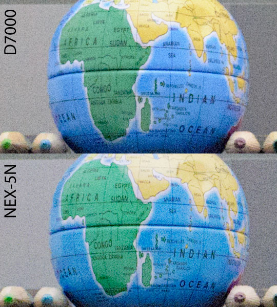
So a few clever souls have noticed by now that there are subtle differences here. Some of the places are clearer on the Nikon image (e.g. SUDAN) and some are clearer on the Sony image (e.g. TANZANIA) …
There are so many possible variables here – focus point, lens quality near the top of the image, anti-aliasing filter, the statistical nature of noise distribution – that there is no way to say that this difference means anything. These letters would be barely legible at 20” on a print 4 feet wide, so there is no way they will even be visible on any normal presentation of this image.
So again we have a wash. Very nice for both cameras. Very, very nice since this is 6400 ISO.
Crop 3
This is one that often shows up some edge integrity issues. The paper clips look soft or lose their 3-dimensionality sometimes.

Here, both look great, but this is the first crop that shows some loss of edge definition. The Sony does not have much local contrast here, even though it is fine everywhere else in the image. I would tend to want to put this down to either the focus point or the lens used on the Sony.
Again, not something you would see in any print normally made with these cameras from super high ISO images …
Crop 4
This one shows how fine, low contrast detail is handled. The hair at the bottom left is often smeared by small sensors. Whereas these sensor retain good definition even as ISO climbs. This is an excellent performance for any sensor, including full frame in my opinion. Of course, the next generation full frame sensors will probably spank this performance, but for now it is really impressive.
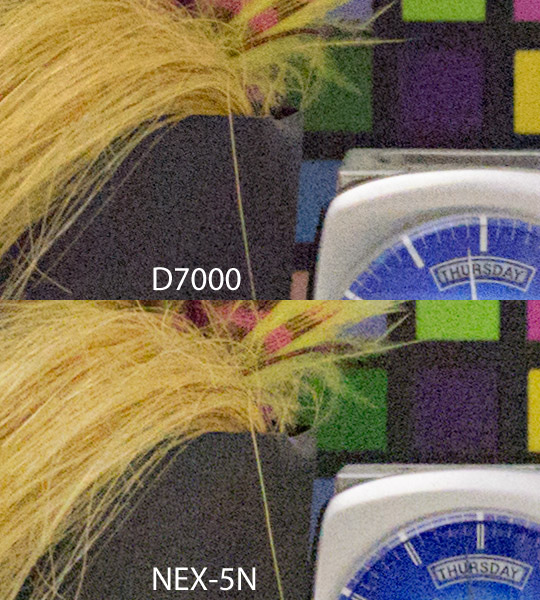
The one real difference here is the watch face. the second hand is almost invisible on the Sony shot, and that’s because the tone is too close to the watch face itself. This is an unfortunate and very subtle difference in lighting or a reflection. But this drop in light intensity does allow the split markers to show perfectly, so it is 6 of one and half a dozen of the other here.
The hair looks essentially identical, and that’s what this crop is really about.
Conclusion
The statement that started me looking at this is total bollocks. Once you process the camera’s output to match, you actually do get a match. Which means that each camera is capable of the same basic results. Presuming that the shooting situation is within the body and lens parameters that are at hand.
Update: Remember that this conclusion was drawn against the comment that started me looking. It is not meant as an overall judgment of relative worth or any sort of rigorous test.
Addendum
Lots of interest in this one. I suppose that means I should clarify my thoughts beyond the simple premise of the original post.
- I acknowledge that the jpeg engine of the Sony is slightly better. Bearing in mind that none of the advantages will be obvious at any normal sized print, so I don’t really see much of a practical advantage.
- I acknowledge that the Sony is very compact and light and that might be the overriding requirement. If it is, then you could do far worse.
- But …
The DXOMark measurements back what I have been saying. There is little difference in noise so that cannot be much of a factor. For example, the SNR 18% is a normalized plot of the noise at each ISO and the two are effectively neck and neck until the Sony take a 2/3 stops lead at 12800 and 25600. I suppose bar shooters might find that interesting … but at those ISOs your skills make *far* more difference than 2/3 stops of noise.

But dynamic range differences are a bit more dramatic. Wedding shooters and those who like their images contrasty might prefer some latitude to pull out shadow detail and here is where the Nikon shines. Slightly more than one stop better DR …

The 5N finally catches up by 800 ISO, but that means that pretty much all low ISO shooting is advantageous with the D7000. Wedding photographers, for example, would use the D7000 for any outdoor shots unless it was cloudy.
The rest of the measurements – tonal range and color sensitivity – are again neck and neck. No salient difference.
So … which do you buy? I think the answer is obvious. Whichever the hell you like ![]()